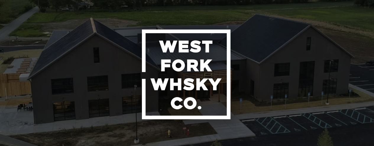
Indianapolis-based West Fork Whiskey wanted a new label-design system that would stand out from the traditional designs flooding the market. West Fork Whiskey is known for producing the best affordable whiskey in the Midwest and wanted to rebrand its product line to reflect this continued growth and success.
We set out to create a labeling system that worked not only with the current products and their existing logo, which could easily expand as the line grew in the future.
Material Preparation
With a consumer market as large and diverse as spirits, we took a different approach to kick off the project and better understand the design tastes of West Fork’s decision-makers. Instead of a standard digital presentation, Matchbook created a series of large mood boards presented in person on easels.
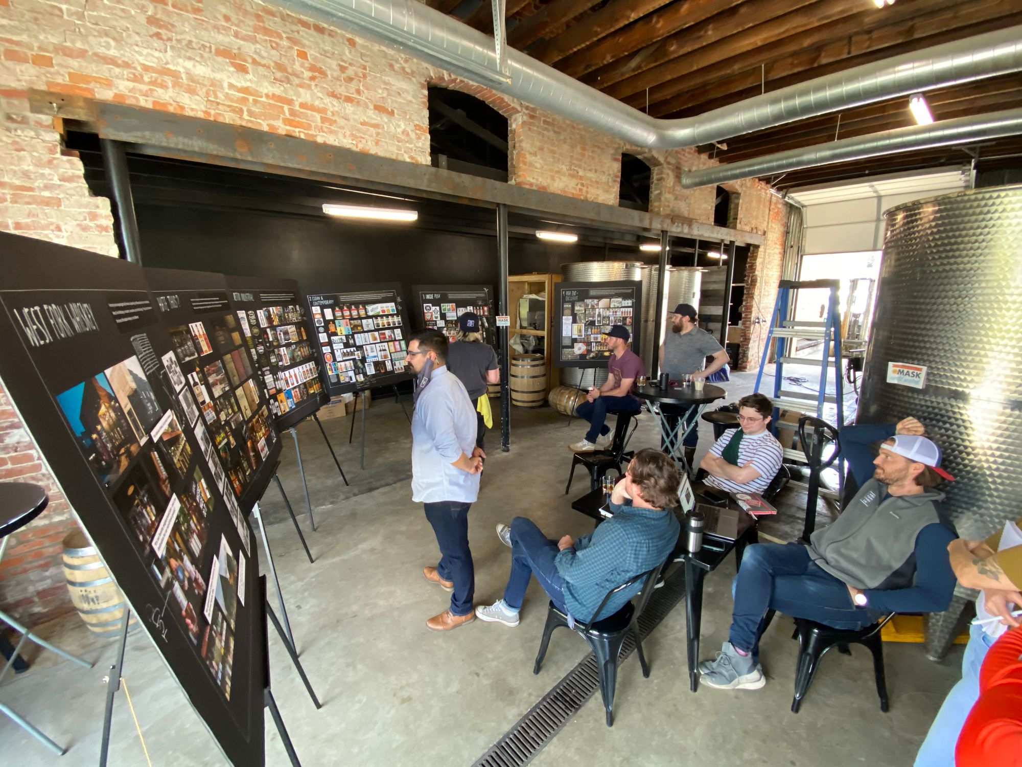
Each mood board displayed a specific design style. During the presentation, we walked the West Fork team through each board, taking notes directly on the boards about what elements they did and didn’t like. This immediate feedback not only helped us better understand their tastes and style, but we were also able to really dive into nuance, which is a critical component for packaged goods when the market is saturated.
Brand Fermentation
The feedback from the initial mood board phase was invaluable for a project like this. With a solid focus on what West Fork was looking for, our creative team was able to start designing quicker and in a more targeted way which meant fewer rounds of revisions later in the project.
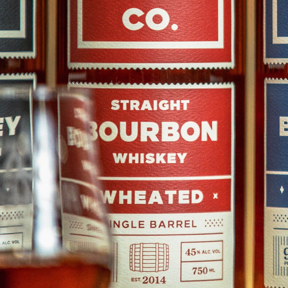
Distilling the Brand
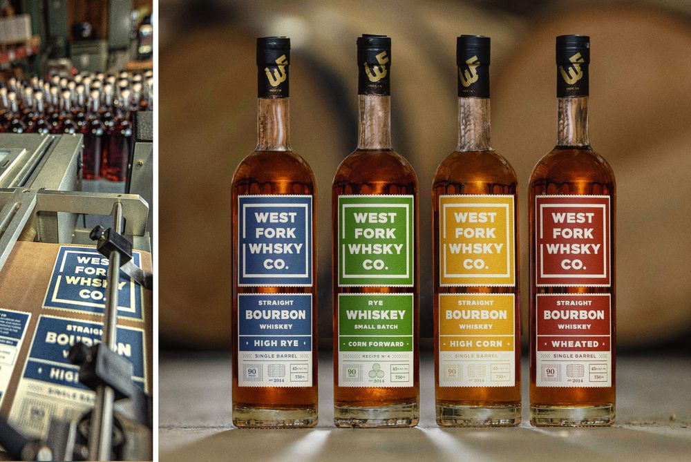
The label system is sleek, modern, and clean to stand out among competitors with a more historic or Western look that dominates the market.

The new system uses the West Fork logo as the focal point of the design. Bold clean type and a color-coded system make each bottle distinct and easily identifiable from the others in the line.
Watch The Video
This clean design also allows for future system expansion. One of the factors that went into creating the system was a focus on ingredient transparency as part of the label design. The back of the bottle features each whiskey’s recipe, source, age, and mash bill highlighting West Fork’s grain-to-glass philosophy. We also created an illustration to be used in future promotional materials focused solely on the grain-to-glass philosophy.