Indiana Bankers Association
The Indiana banking industry thrives because of favorable regulations and a pipeline of new talent entering the field. The Indiana Bankers Association is who to thank for it.
Graduates entering the workforce are looking for a career they can see fitting their professional goals and their personality. So for IBA, retaining its relevance to its current and future members is vital. When it comes to a professional organization that has been around for 125 years, how do you bring them into the here and now? Or, how do you make them cool?
A Face for Banking
Unfortunately, it’s not as simple as putting a pair of shades on a beagle. The Indiana Bankers Association asked us to help bring back their edge.

The IBA was established 125 years ago as a trade association for Hoosier banks. While they still influence the industry at the state level, leadership felt like they weren’t connecting to younger generations interested in getting into banking as a career path.
After having the same look for 15 years, the initial ask was for an updated logo. But, a deeper look at their goals for the future revealed the need for something more in-depth.

An Investment in the Future
Figuring out how to make banking an attractive career opportunity required bringing a sense of energy to the brand to signal the energy of the organization behind it. We refreshed the image, pairing it with the leading marketing language as the best foot forward.
We put together some key recommendations to introduce the next chapter of IBA’s story. Some of the ideas we wanted to introduce were as follows:
- Change the focus to the individual experiences in the industry, as opposed to corporations.
- Highlight career paths from all levels of the industry to showcase how rewarding banking can be and what a difference it can make in the community.
- Shorten up your messaging to be more easily captured by multiple audiences.
The Visual Identity

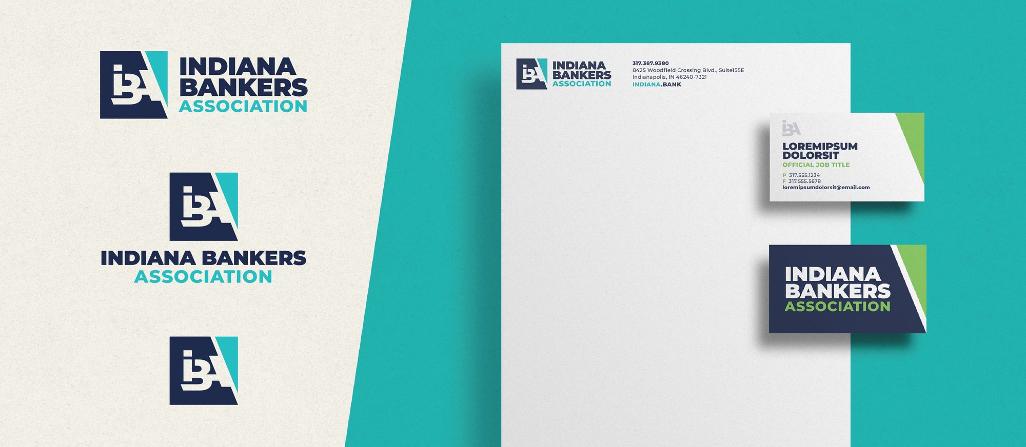
The logo represents the central figure of the IBA brand. The creative process began with dozens of logos. The creative team approached this with a 360° view and put numerous options on the table.
A big challenge was giving IBA something fresh for the new age of banking, while continuing to fit the temperament of industry expectations. IBA ultimately chose three letters locked into a mark as their logo. An upgrade from their previous logo, it encompasses IBA’s goals for the future while providing a level of sophistication.

The Brand Message
As the Indiana Bankers Association embraced a new era, communicating their value is essential. As part of a complete brand identity, IBA received supporting messaging for a strong value positioning stance and brand voice:
It all starts with Indiana banks.
Our best assets are your bankers.
Updates to the messaging and logo created a focal point for the celebration of their 125-year anniversary while signaling new opportunities on the horizon for the industry.


