Competing Priorities
We’re always trying to point our customers to the end result. For brands on the web, our ultimate goal is clear: guide customers from brand discovery to product purchase and eventually to brand loyalty. If we get them all the way through this journey, they’ll probably buy from us over and over and recommend us to others. However, the path to this ideal outcome is far from straightforward, especially when dealing with diverse customer groups and product lines.
The challenge arises from catering to several different customer groups, each with unique starting points and needs. Because of that fact, we have to connect with all of them and offer the right products to begin with. One customer needs a new top, and another needs a pair of pants. One is looking for golf gear. Another for swimwear. Our job is to catch their attention on our website before they move on.
Naturally, your first inclination is to entice them from the moment your site lands on their screen. By focusing on content above the fold—the part of the website visible without scrolling—we aim to place our most crucial messages. However, with multiple customer segments and departmental priorities, choosing what to feature becomes a delicate balancing act.
The fair approach offers the most equal weight for the different messages. How do we give the T-shirt department, the golf department, and the swimwear department what they want at the same time?
The common approach is to implement a carousel on your website (also known as a “slider”). In this case, every major message is featured equally for a few seconds. As a bonus, it also adds movement to our site, which gives us some excitement and catches our customer's attention.
At first glance, it appears to solve our dilemma – but does it really?
A Trade-Off
When we resort to the carousel, we’re telling ourselves what we want to hear. We believe that every one of our messages will be seen, and we’ll catch their attention before their cat-like reflexes send them to another site that suits them better. But it’s not true, and our department heads being convinced of the idea won’t change the truth.
Carousels do have a few benefits, but bricks have a lot of benefits, too. They just don’t make very good cell phones. According to GT Metrix, a site that tests screen performance, carousels consistently reduce site performance. The additional CSS and JavaScript required for their functionality increase page load times, potentially driving impatient users away before they even see your content. Ironically, this negates the very purpose of prioritizing 'above the fold' content because if users don’t scroll, they certainly don’t wait.
Beyond performance issues, the biggest problem is that sliders are consistently ineffective. The click-through rate of a slide on a carousel is heavily weighted toward the feature in the first position. Click-through drops dramatically after that. This shows us that by attempting to equalize our featuring of multiple headlines, we strongly favor one and bury the others. The irony is that keeping everything above the fold effectively reduces the likelihood of it being seen or interacted with.
Forget About the Fold
Marketers are all too often willing to sacrifice clarity and engagement in an attempt to cram everything into the small space above the fold. This issue within websites highlights a bigger issue with our marketing as a whole. It points out that we don’t know what our core message is.
A marketing message is a journey, in a sense. Think of it no longer as a stack of equally weighted messages but as an architecture of messaging points that are built to support the whole structure. Like a well-structured story or a pleasant walk in the park, each element should build upon the last, creating a cohesive and engaging experience. Trying to present everything at once overwhelms the user and dilutes your message.
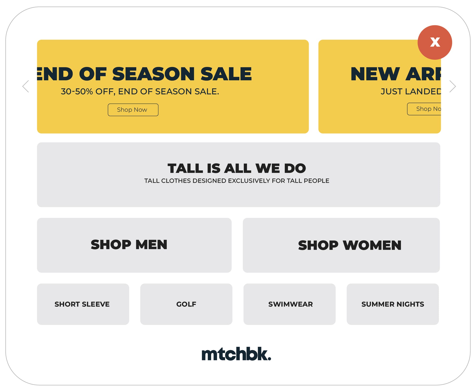
Consider the brand American Tall. American Tall is the source for yours truly for T-shirts that fit. At 6' 5'', I'm looking for something specific. Other audience members are looking for something specific as well, and however different it may be, the central theme is consistent. As a brand, its central message is tall. Not golf. Not swimwear. Not free shipping for orders over $75. Their goal is to introduce their most important message right off the bat and then build on that with the supporting messages. They use their feature section to highlight the message of the moment. In this case, they offer two competing messages. They are placed over a base of the brand's key message. Then, pillar messages highlight product categories. The brand builds a clear story and uncovers its product line like a walk in the park. but their feature section distracts from the very point of the brand and immediately introduces a break in clarity. Today, their home page messaging looks somewhat like this:

While American Tall got it close, they could do a little better. Highlighting the sale of the moment or the new inventory is not a bad idea, but by putting them in a carousel, they cause the two to compete, reducing the chances of one of them if studies hold true. Notably, the two messages are in conflict with each other. Check out our old stuff. Check out our new stuff.
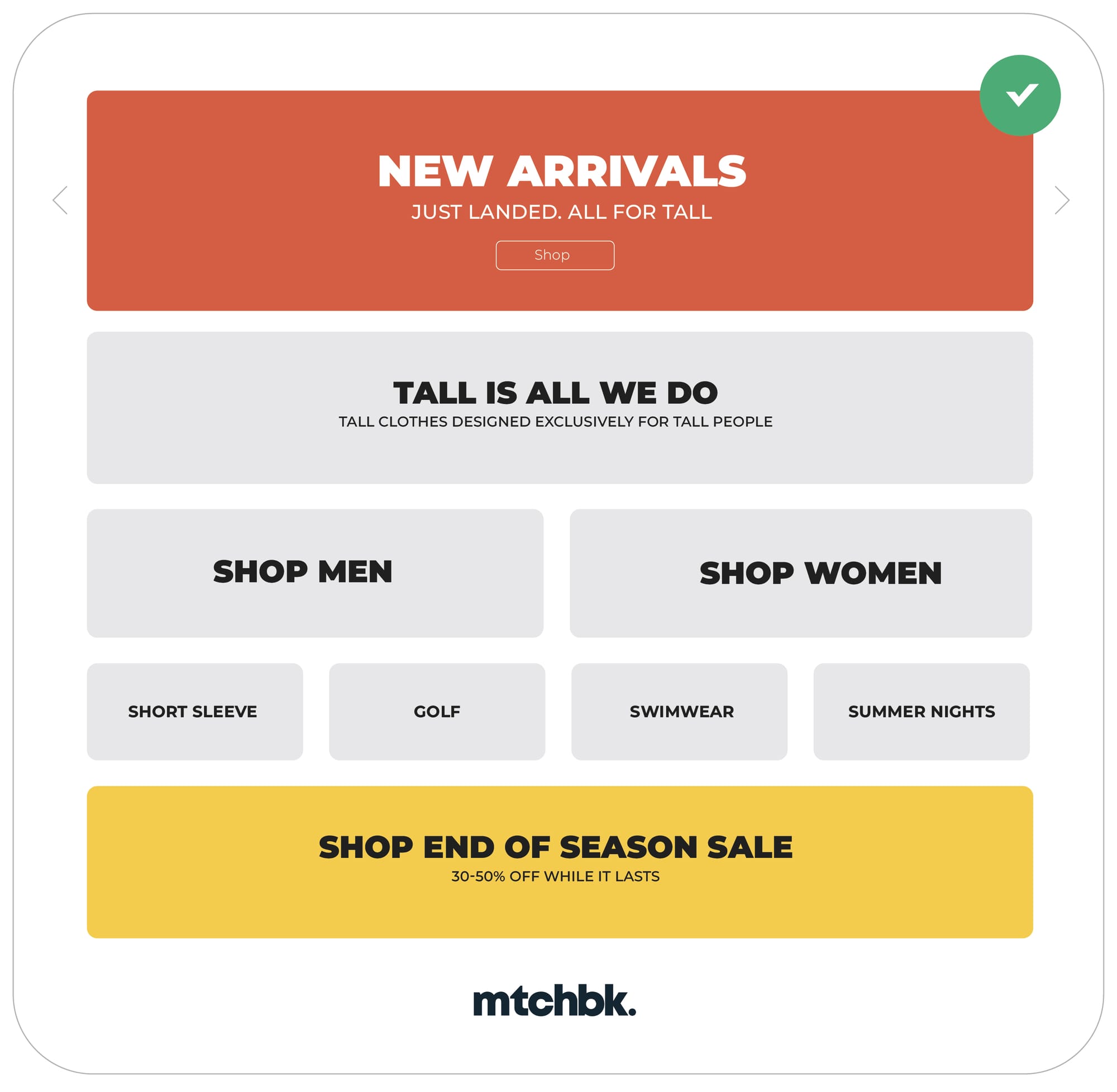
The better approach would be to lean into a single message, highlighting not only the special deal of the moment but also their core message. Using copy they already created, I would suggest something like this:

Starting with a single message allows the brand to highlight what is most important for the season. This structure allows them to capture each member of their audience based on the features they share. They want clothing designed for tall people like them. They start with an action-oriented message that changes seasonally while still leaning into their evergreen message upfront. Then each relevant subset of their message unfolds as the customer digests the content on their page.
When we create messaging that is focused first on a narrow set of priorities and then builds upon it, we increase the chance that we will connect with our customers. Less is more—a simple, clear message will always outperform a cluster of competing ideas. If we keep this in mind, not only will our websites perform better, but our businesses will, too.


